Recognisable, refined.
Typography, colour and the fingerprint symbol create a consistent visual direction, with room for both clear product information and a more personal brand voice.
01 / ZITAMINE

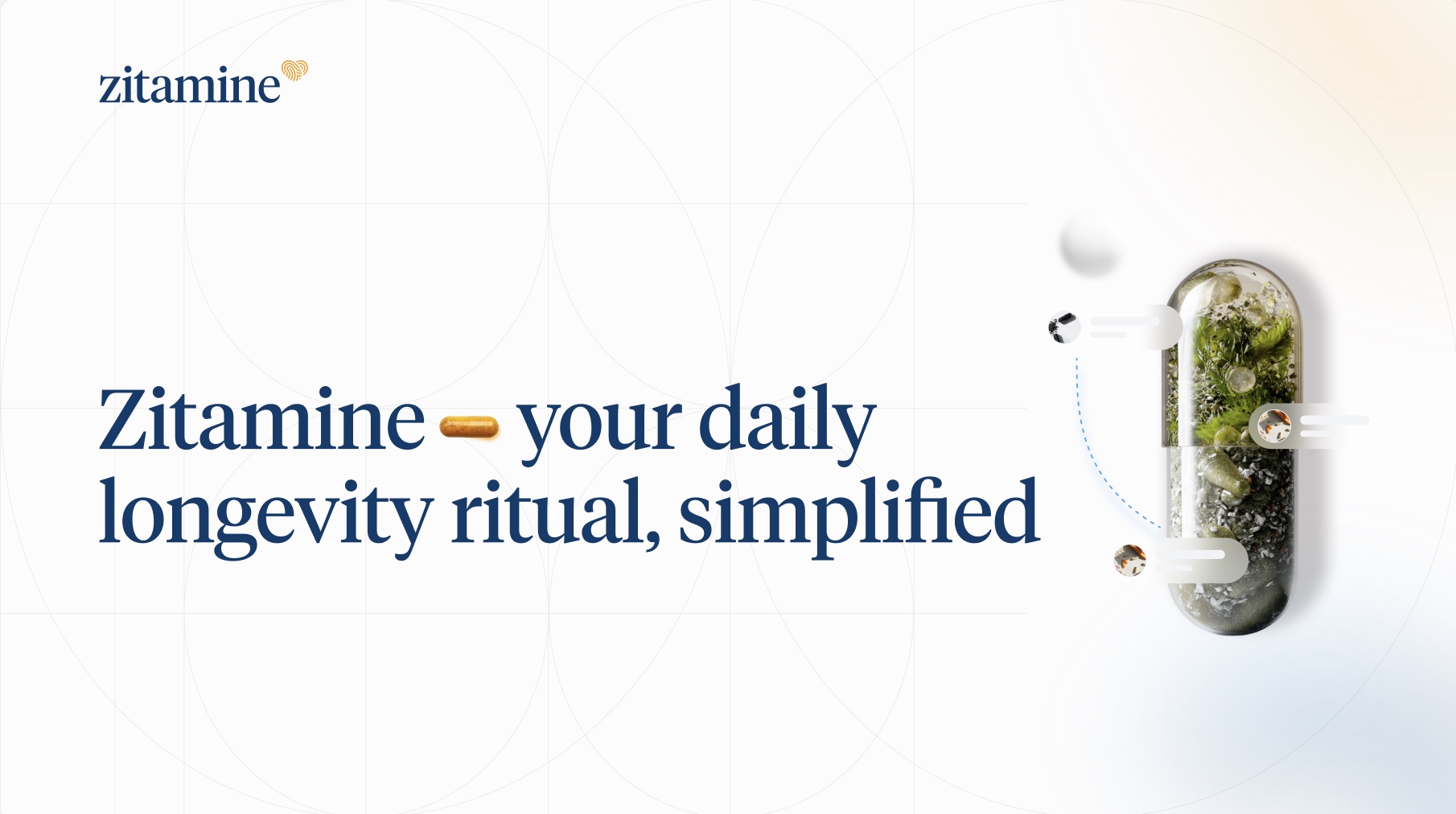
A visual identity refresh, carried from the packaging into the digital experience and everyday brand communication.
02 / OUR CONTRIBUTION
Our work for Zitamine brought the visual identity, packaging and digital design into a more consistent system. The aim was to retain the brand’s recognisable character while giving its product range and communication a clearer shared language.
We applied that direction across the packaging family, website layouts, Zitamine Pro interface designs and campaign materials shown in this case study.
Typography, colour and the fingerprint symbol create a consistent visual direction, with room for both clear product information and a more personal brand voice.
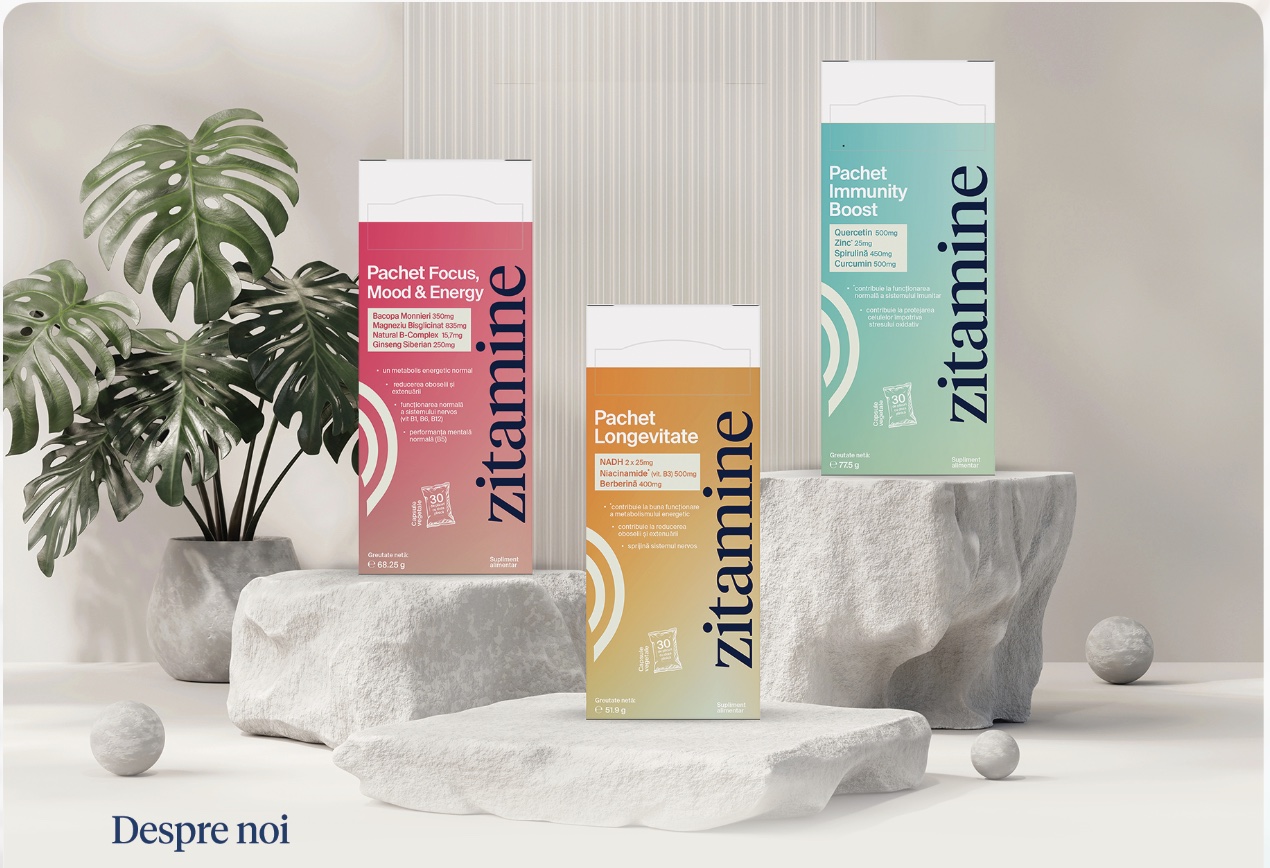
A shared structure brings the range together. Different colour treatments help each pack stand apart while the wordmark, information hierarchy and graphic language remain connected.
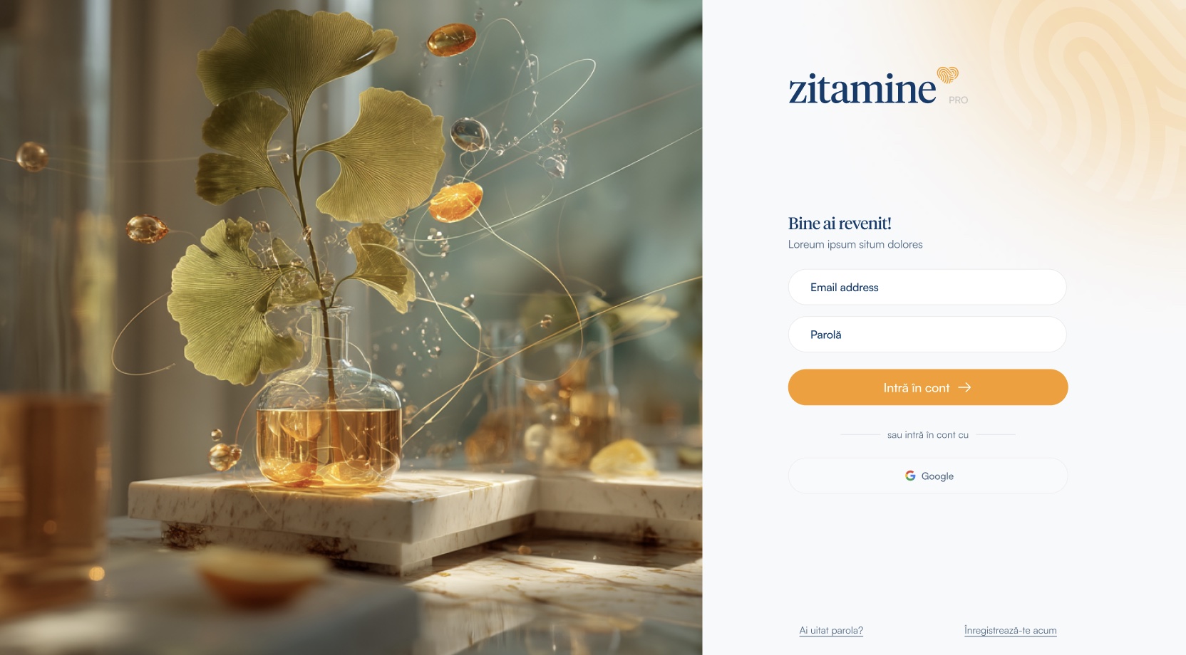
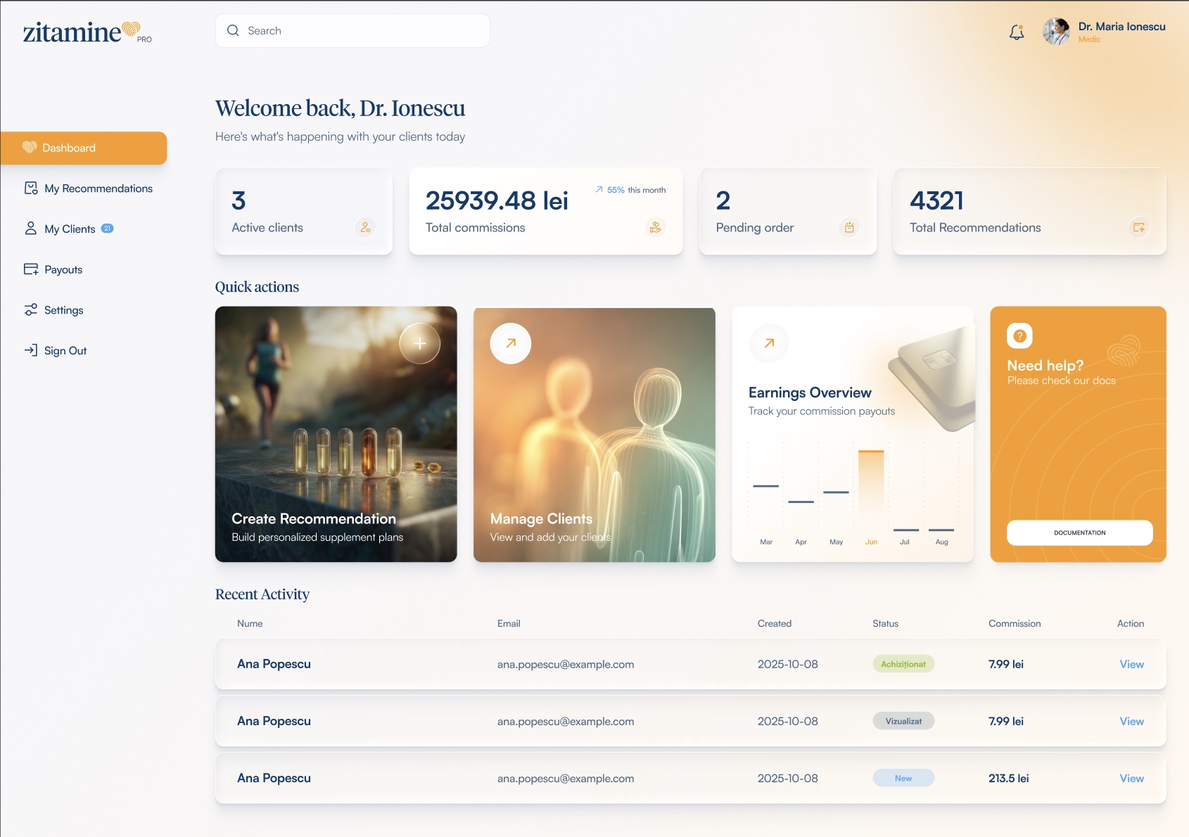
Website and Zitamine Pro layouts extend the refreshed identity into product discovery, account access and professional-facing workflows.
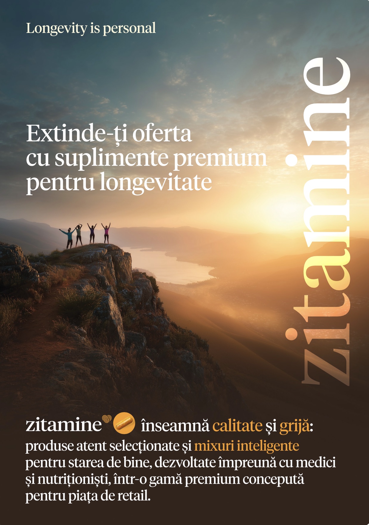
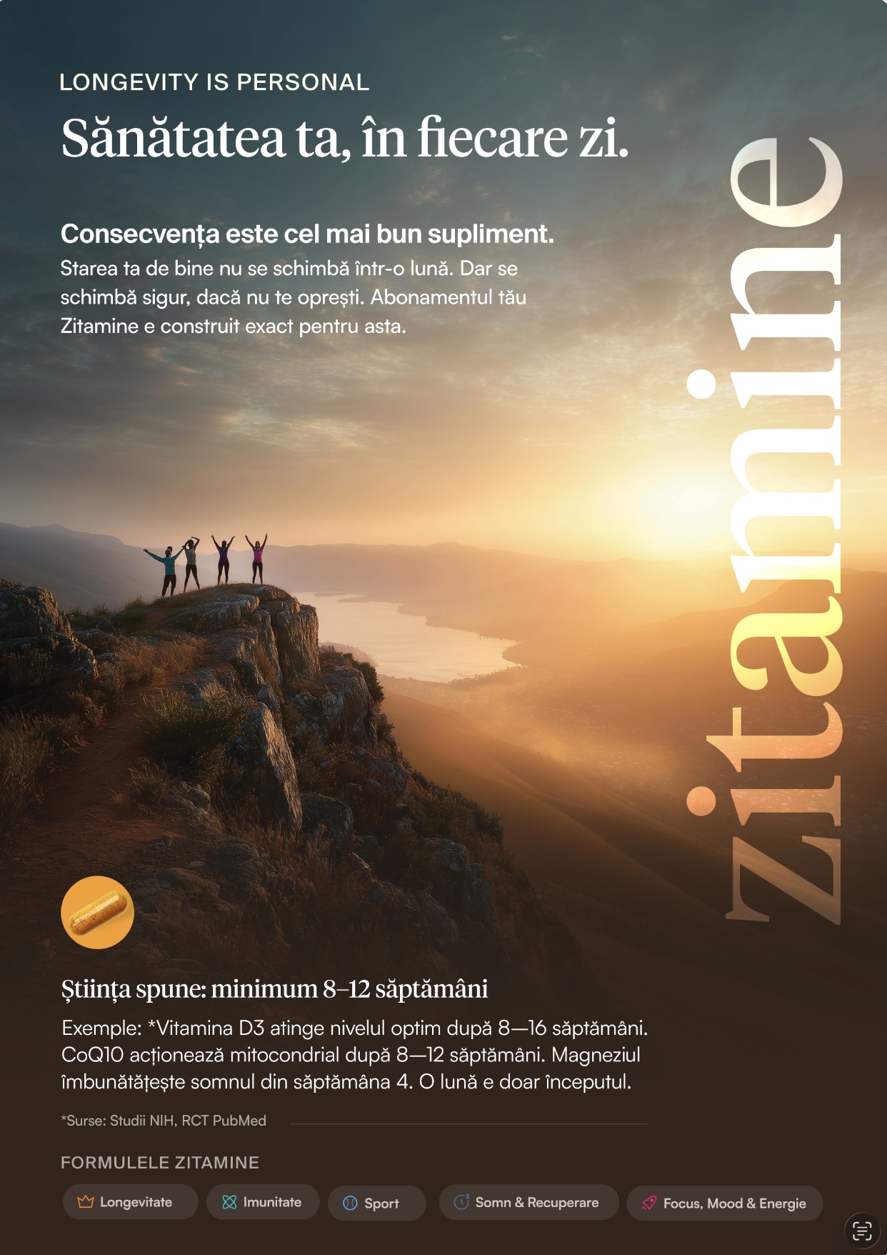
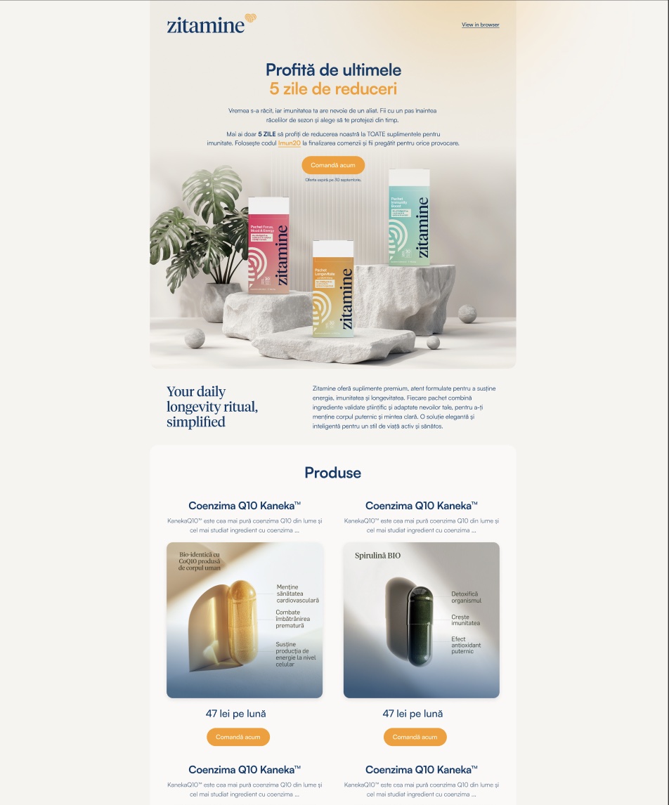
Campaign, retail and email designs carry the brand’s typography, imagery and palette into different formats, keeping the experience visually coherent.
03 / THE PACKAGING SYSTEM
We designed the packaging as a coordinated range: a recognisable vertical wordmark, a consistent reading order and expressive colour combinations for individual packs.
The presentation pairs precise product information with softer gradients, tactile materials and a bright, natural visual world.

04 / WEBSITE DESIGN
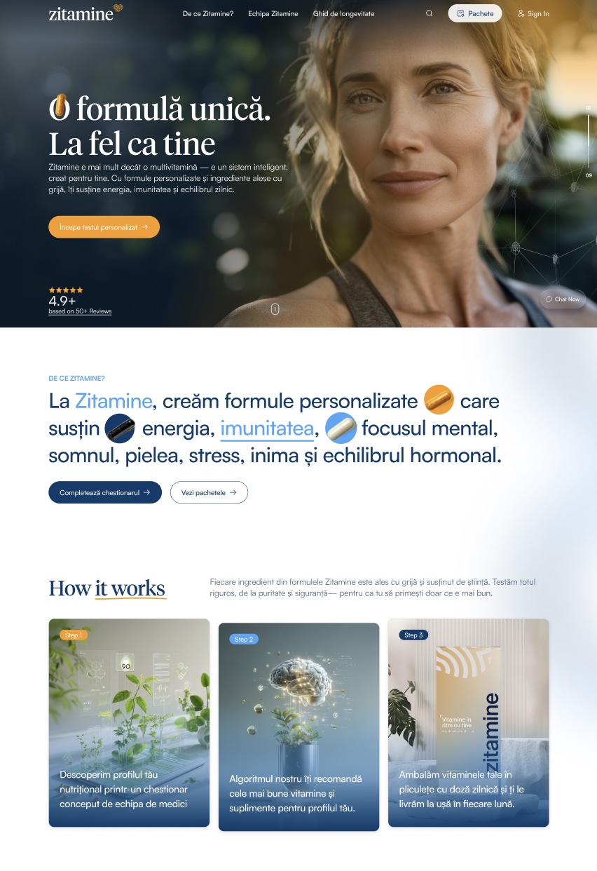
We extended the identity into website layouts with an editorial type hierarchy, spacious composition and distinct product and content sections.
Product imagery, the personalisation journey and clear calls to action give the digital presentation structure, while navy and orange keep the interface recognisably Zitamine.
 WEBSITE DESIGN / HOMEPAGE
 RETAIL COMMUNICATION / BRAND STORY
05 / ZITAMINE PRO
The professional-facing interface needed a more functional expression of the same identity. We designed account-access and dashboard layouts that keep navigation, activity and key actions easy to distinguish.
The softer backgrounds, navy information hierarchy and orange accents connect Zitamine Pro to the wider brand without making the workspace feel like a campaign page.
06 / CAMPAIGN & EMAIL
We carried the refreshed visual direction into campaign and email layouts, using the same typography, imagery and product presentation across longer-form communication.
Each format has its own pace and hierarchy, while the overall brand remains connected to the packaging and digital experience.
07 / THE COMPLETE PICTURE
A visual identity refresh expressed through a family of packaging, digital interfaces and communication materials. The work shown here focuses on design; interface values and product copy are part of the supplied presentations, rather than performance results.