A recognisable signature.
Logo and symbol, typography, colour palette and a repeatable graphic pattern. A system that works at the scale of a website header or a billboard.
01 / TRANSYLVANIA HARMONY TRAVEL
Visual identity, website and art direction for a travel company rooted in Transylvania. A connected brand experience, from the first impression to the journey itself.
02 / THE BRAND DIRECTION
Transylvania Harmony Travel needed a visual world that could express the character of the region while feeling welcoming to an international audience. The direction brings together landscape, culture and a more considered pace of travel.
Our design work connects the identity, website and brand presentation. A distinctive symbol, editorial typography, rich blue and copper accents create a shared language across the digital experience, campaigns and physical brand applications.
Logo and symbol, typography, colour palette and a repeatable graphic pattern. A system that works at the scale of a website header or a billboard.
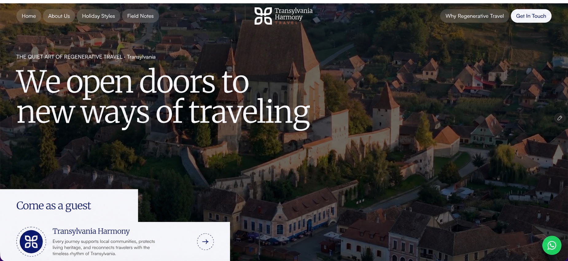
Art direction, page layouts, navigation and content hierarchy for the travel website, connecting destinations, holiday styles and the brand story.
Visual storytelling, editorial messaging and campaign composition. A consistent presentation across destination stories and promotional materials.
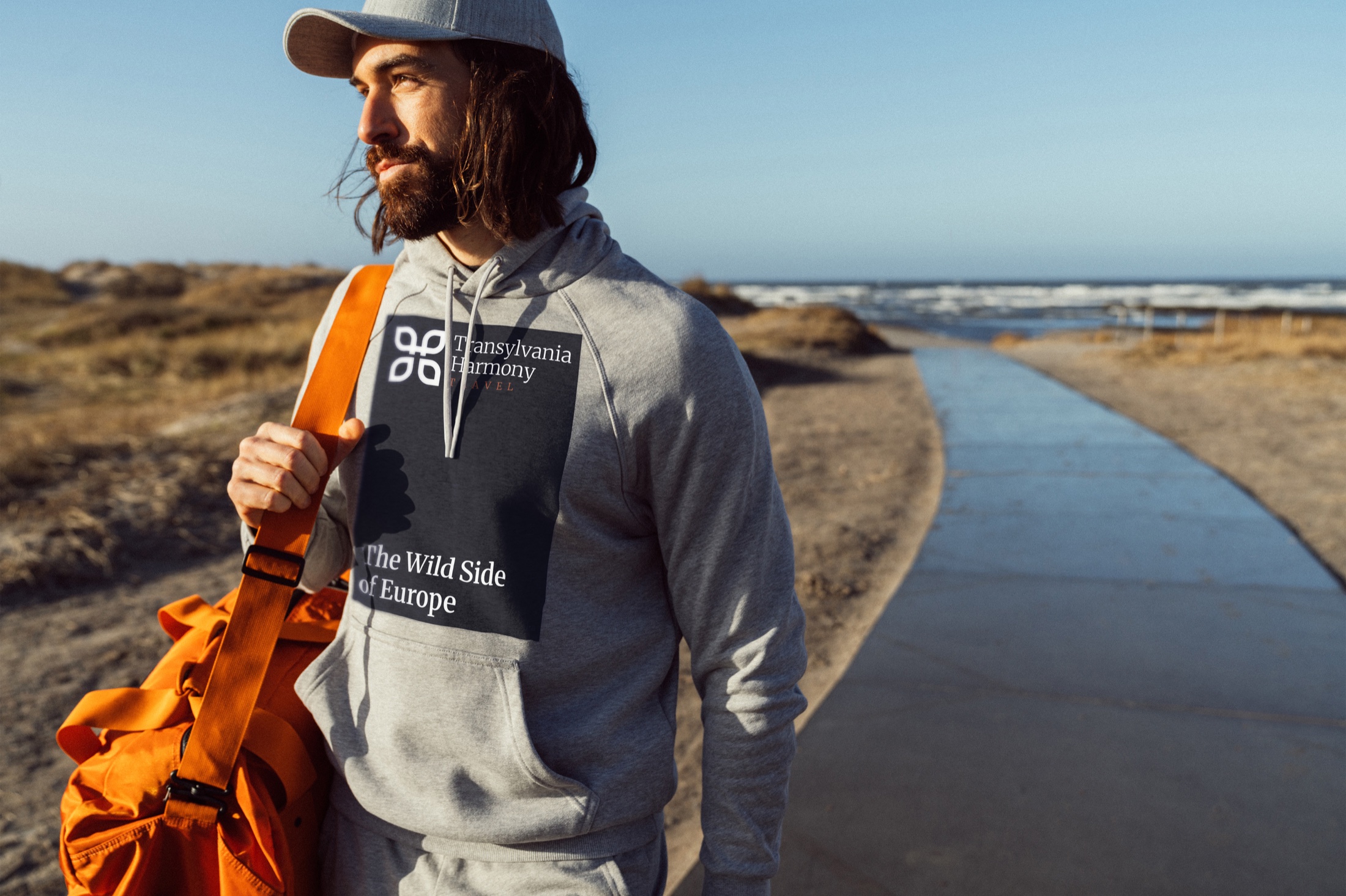
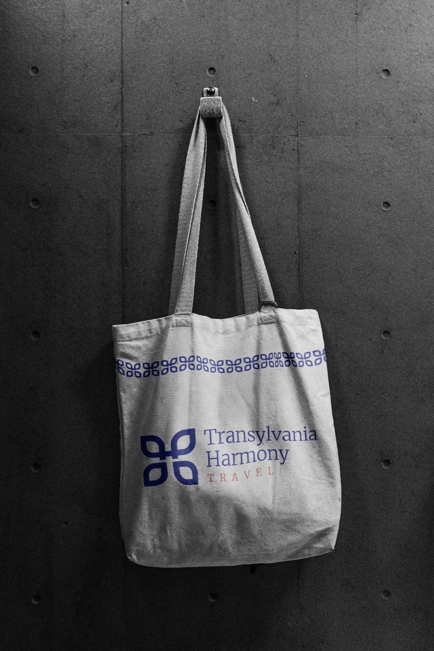
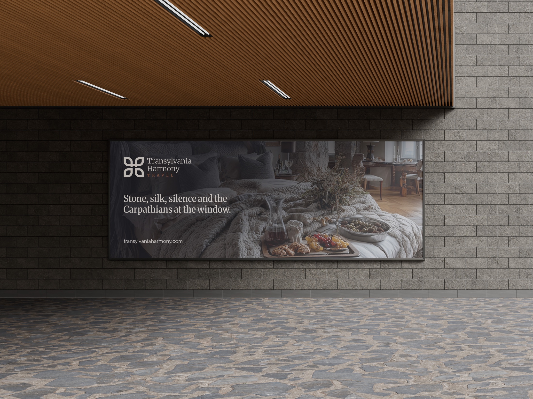
Outdoor advertising, apparel and tote bag applications. The same identity expressed through photography, materials and a flexible pattern language.
 THE IDENTITY / SYMBOL, WORDMARK & COLOUR
03 / THE VISUAL LANGUAGE
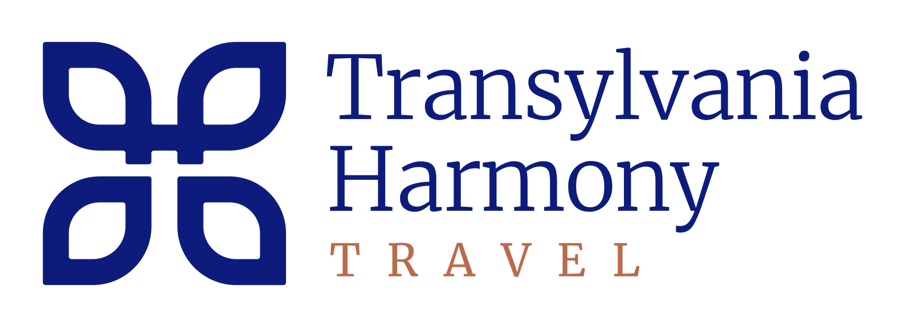
The four-part symbol gives the identity a compact, recognisable centre. Its repetition becomes a decorative border, while the serif wordmark lends the brand an editorial character.
Blue provides a strong signature. Copper introduces warmth. Photography carries the atmosphere of the destination, with typography giving each story a clear voice.
EDITORIAL CHARACTER / HUMAN SCALE
A distinctive voice, carried through the wordmark, campaign headlines and website storytelling.
04 / CAMPAIGN ART DIRECTION
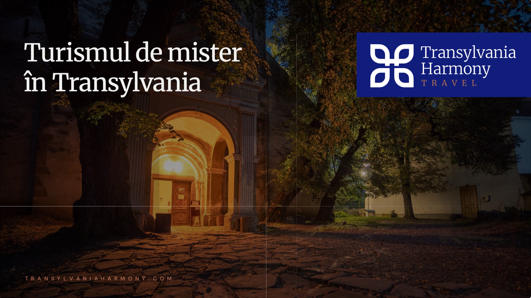
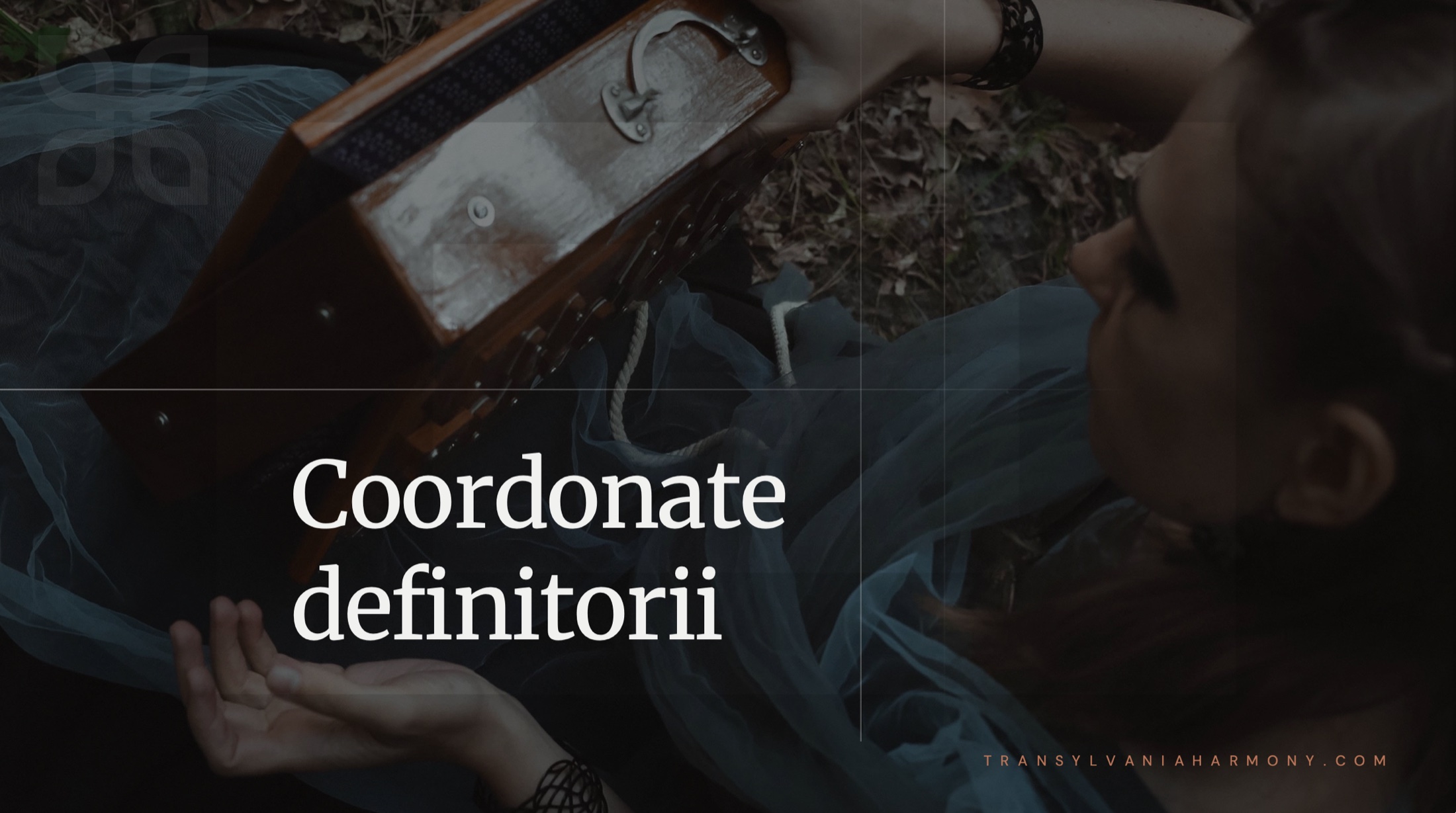
The art direction gives the destination room to speak: evocative photography, spacious headlines and a recognisable brand signature.
Campaign compositions explore different sides of Transylvania, from mystery and heritage to quieter, more intimate moments. The shared typography, image treatment and copper details hold the communication together.
05 / THE WEBSITE EXPERIENCE
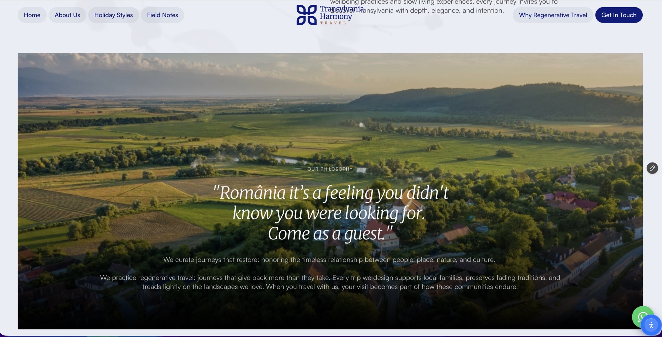
The website translates the identity into an immersive travel experience. Landscape-led compositions, editorial headlines and clear navigation introduce the company, its holiday styles and its approach to travel.
The design gives the brand story and destination imagery space, while keeping the next step visible. Blue and copper connect the digital experience to the identity and campaign materials.
06 / THE CONNECTED PICTURE
Visual identity, website design, art direction and branded applications for Transylvania Harmony Travel. A consistent design language across the places people meet the brand.